Six Creators Who Consistently Nail the Three-Panel Structure
by Thea VoutiritsasThe familiar three-panel comic strip is the ultimate litmus test for a good comic artist. It’s constructed of three simple elements: a set-up, reinforcement, and a punchline. True masters can turn this classic form into a fresh laugh without going stale. Here are five comic artists who consistently nail the three-panel structure:
1. Mike Du Jour by Mike Lester

We love Mike Lester’s unique, unpredictable wit in Mike Du Jour. This three-panel comic on sets up a casual conversation turned awkward. The captionless middle panel gives us all we need to know for the punchline.
2. The Adventures of Business Cat by Tom Fonder

Business Cat never fails to be, well, a cat. Like the previous strip, this one features a captionless middle panel. The pause here makes for perfect comedic timing. Creator Tom Fonder is a longtime fan of classic comics like Calvin and Hobbes and Garfield, though his own cat largely inspires the content in The Adventures of Business Cat.
3. Pearls Before Swine by Stephan Pastis

Rat doesn’t much care for Pig’s questions, and he makes that clear in the second panel of this classic example of a three-panel strip. After a quiet start in 2001, Pearls Before Swine gathered a lot of attention from well-known comic artists like Calvin and Hobbes creator Bill Watterson.
4. Scary Gary by Mark Buford

Scary Gary does the three-panel strip a little differently this time around. Creator Mark Buford has a soft spot for gentle, dramatic arcs and conversational dialogue. So, the second panel actually has a caption bubble. The first and second panels keep the dialogue sweet, only to surprise us in the third panel with a touch of cruelty.
5. Webcomic Name by Alex Norris

Webcomic Name puts an offbeat twist on the three-panel strip. With blobby characters and a limited color palette, the strip often pokes fun at the webcomic concept itself. Following the same silent second panel technique, the final panel of each strip always ends in a running “oh no” punch line.
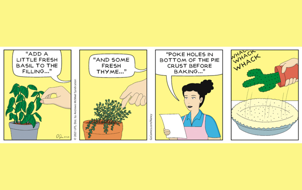
6. Nancy by Olivia Jaimes

Nancy has had the three-panel comic mastered since the 1920s. Cartoonists Mark Newgarden and Paul Karasik posit in their book, How to Read Nancy: The Elements of Comics in Three Easy Panels that everything you need to know about comics can be found in a single Nancy comic. Originally drawn by Ernie Bushmiller and manned by Guy Gilchrist for the last 22 years, the strip was taken over in April 2018 by cartoonist Olivia Jaimes.
Leveraging the comedic rule of three, the three-panel comic packs a quick punch with minimal effort (if you’re doing it right). With careful craftsmanship and a sidesplitting payoff, what’s not to love?






Comments
Featured Comment
Comment Policy
Sign in to comment